Project Overview
The knot is a social mobile app that aims to help people connect with others who have similar interests by facilitating real-life meetups. As the solo product designer, I used user research to identify problems and developed a design solution to address those pain points. The app is designed to be inclusive and create a sense of community.
Team
Individual Project
My Role
Product Designer
User Research; UX Design; UI graphics
Research
Comparative Analysis; Surveys; User Interviews; Usability Testing
Timeline
Feb 2022- July 2022
The Observation
the Covid Social Dilemma
Secondary Research
"You can be lonely anywhere, but there is a particular flavour to the loneliness that comes from living in a city, surrounded by millions of people."
the Lonely City by Olivia Laing
Nowadays, individuals living in the United States are becoming increasingly socially isolated…
People are lacking real life connections via technology.
Connecting with people who live close to you in a big city is harder than we expect.
"According to the US Census Bureau report on America’s Families and Living Arrangements in 2012…the proportion of one-person households increased by 10 percentage points between 1970 and 2012, from 17% to 27%."
American Journal of Lifestyle Medicine
“American adults spend over 11 hours per day listening to, watching, reading or generally interacting with media … contact via technology still falls short and fails to deliver that personal interaction we as humans seem to require.”
Forbes human resources council
“Our computers and phones allow us to stay connected to long-distance family and friends, but this can also prevent us from connecting within our own neighborhoods…Many city dwellers are single and live alone. "
Roots of Loneliness
Comparative Research
There are all kinds of social networking products to help people making new connections and new friends. But there is a gap in those products to really facilitate friendship in a closed community.
User Research
The Interview
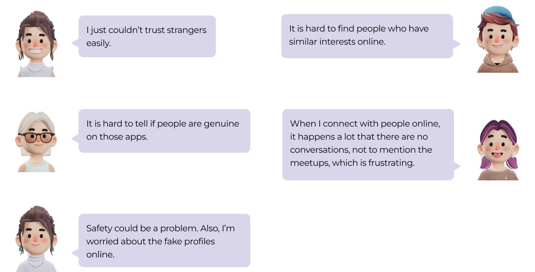
The 5 interviewees are selected from screener survey who are mainly young professionals that live in big cities and have experiences of moving to a new city and are comfortable using social app. The interviews turns out that almost every interviewee is experiencing some frustrations using online product to connect with people:
Quotes from the participants
Synthesizing Research
Affinity Map
The Insights
• It is common to use mobile product to make friends for young adults.
• Looking for a sense of community and belonging is important in social life.
• People with similar interests would quickly connect together
• People’s ultimate goal is to know someone in real life, but it is hard to step outside of their comfort zone and meet new people.
Defining the Problem
How might we create an inclusive community that helps people connect with others who share similar interests and values, and encourages them to meet and make friends?
The Solution
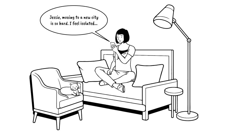
A scenario set in a high-rise residential building designed to bring people together and facilitate connections.
• Connect users based on their interests and nearby events
• Offers suggestions for nearby meetup places and events.
• Allows users to directly contact others they are interested in and propose meetup activities.
Setting up Profiles
Connect users based on their interests and communities.
Connecting with the right pal
Allow users to directly contact others they are interested in and propose meetup activities.
Suggesting nearby events
Offers suggestions for nearby meetup places and events.
Design Process
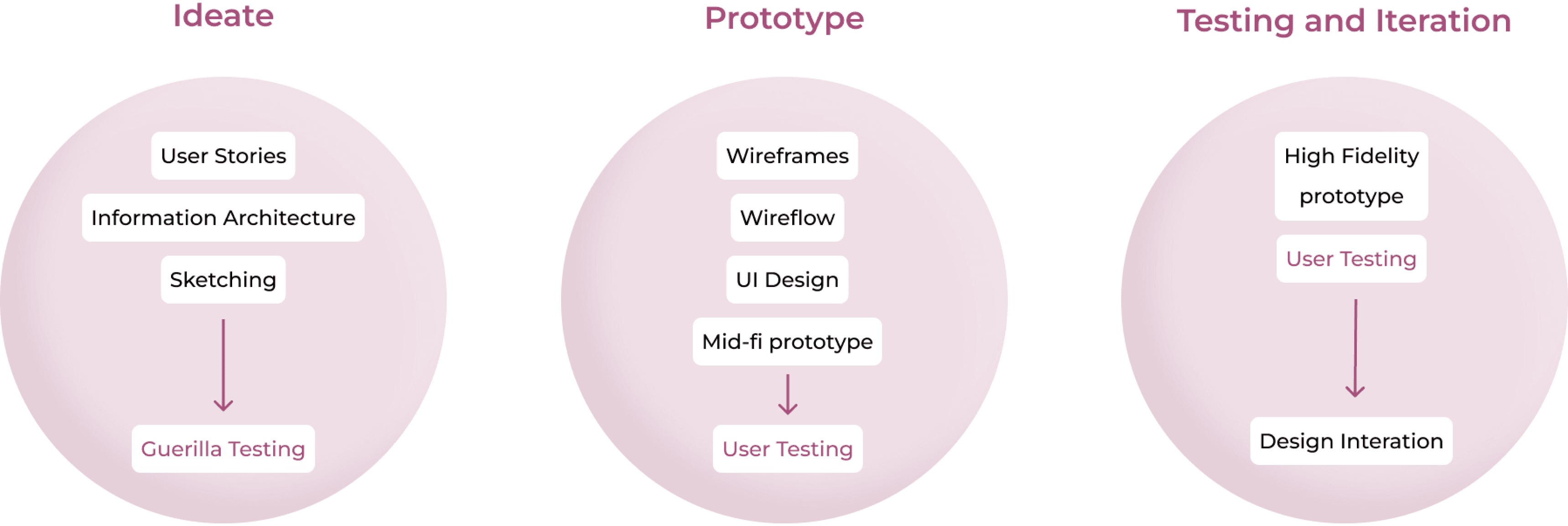
The design process began with brainstorming user stories and drafting a site map. After conducting guerilla testing and sketching out the red route, I created wireframes and wireflow, which were updated based on feedback from the first round of user interviews. The high-fidelity prototype was then iterated based on the results of two additional rounds of user interviews.
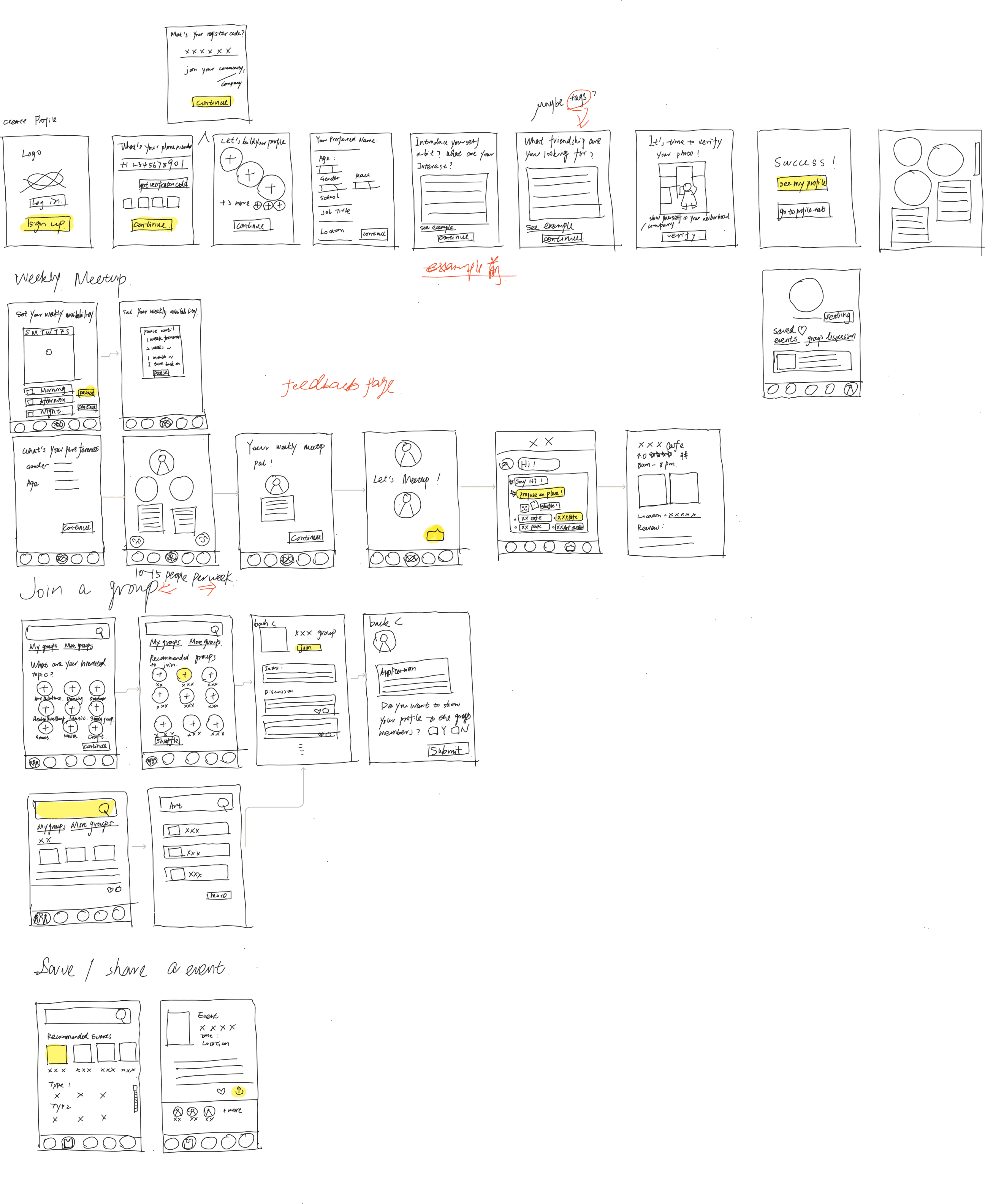
from Sketches to Wireframes
Moving to the wireframe phase, my design is simplified to mainly focus on how to connect people one on one and suggest nearby events.
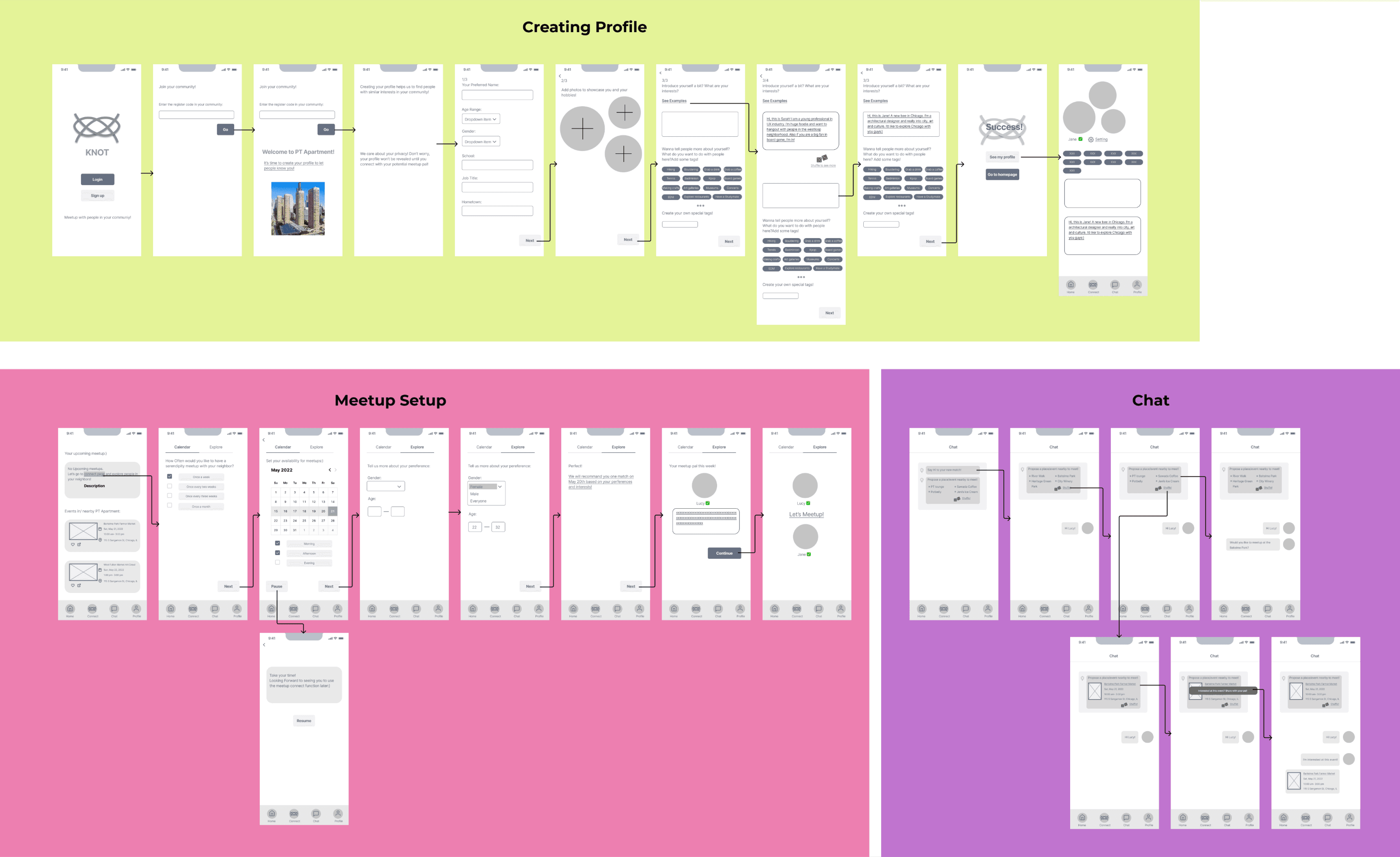
My preliminary thought reflecting on those sketches is providing a wholesome experience for the user to create their profiles, set up their available time to connect and meet up with someone weekly, and also the user can join a group and see events nearby.
The wire flow
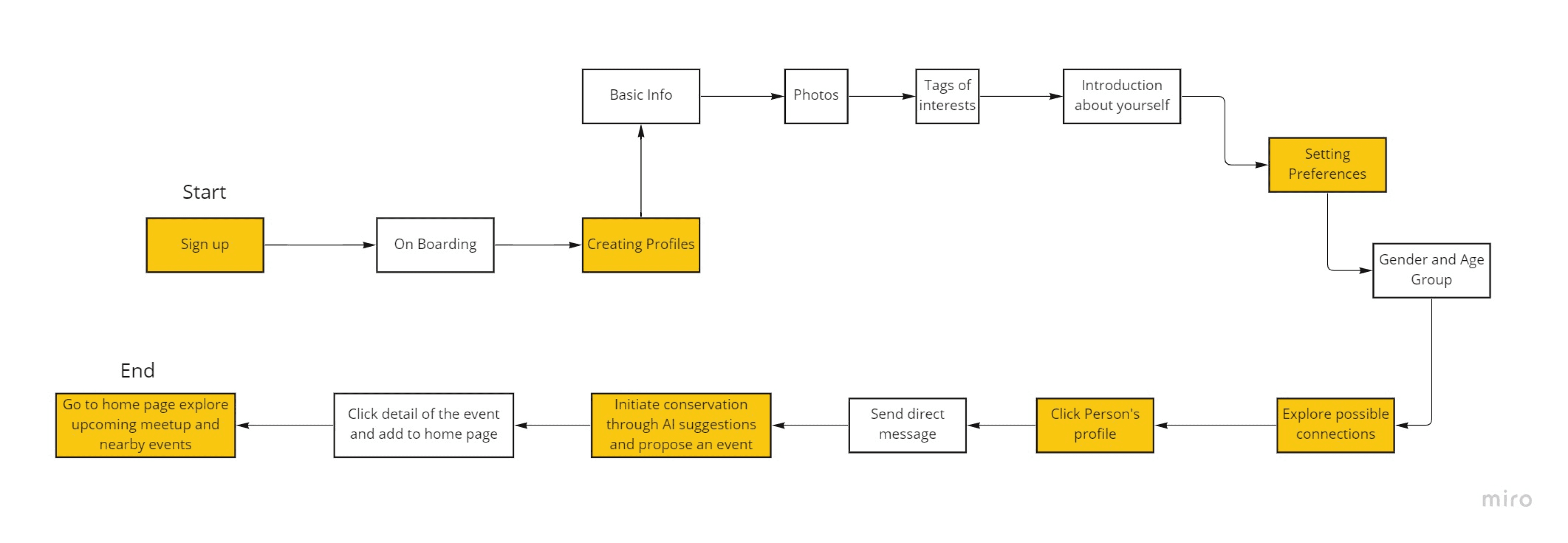
The user flow
Validating and Iterating
I have conducted two rounds of total 8 usability tests, and there are three major issues that I’ve observed. I adjusted the flow and design elements based on users’ feedback.
Issue 1:
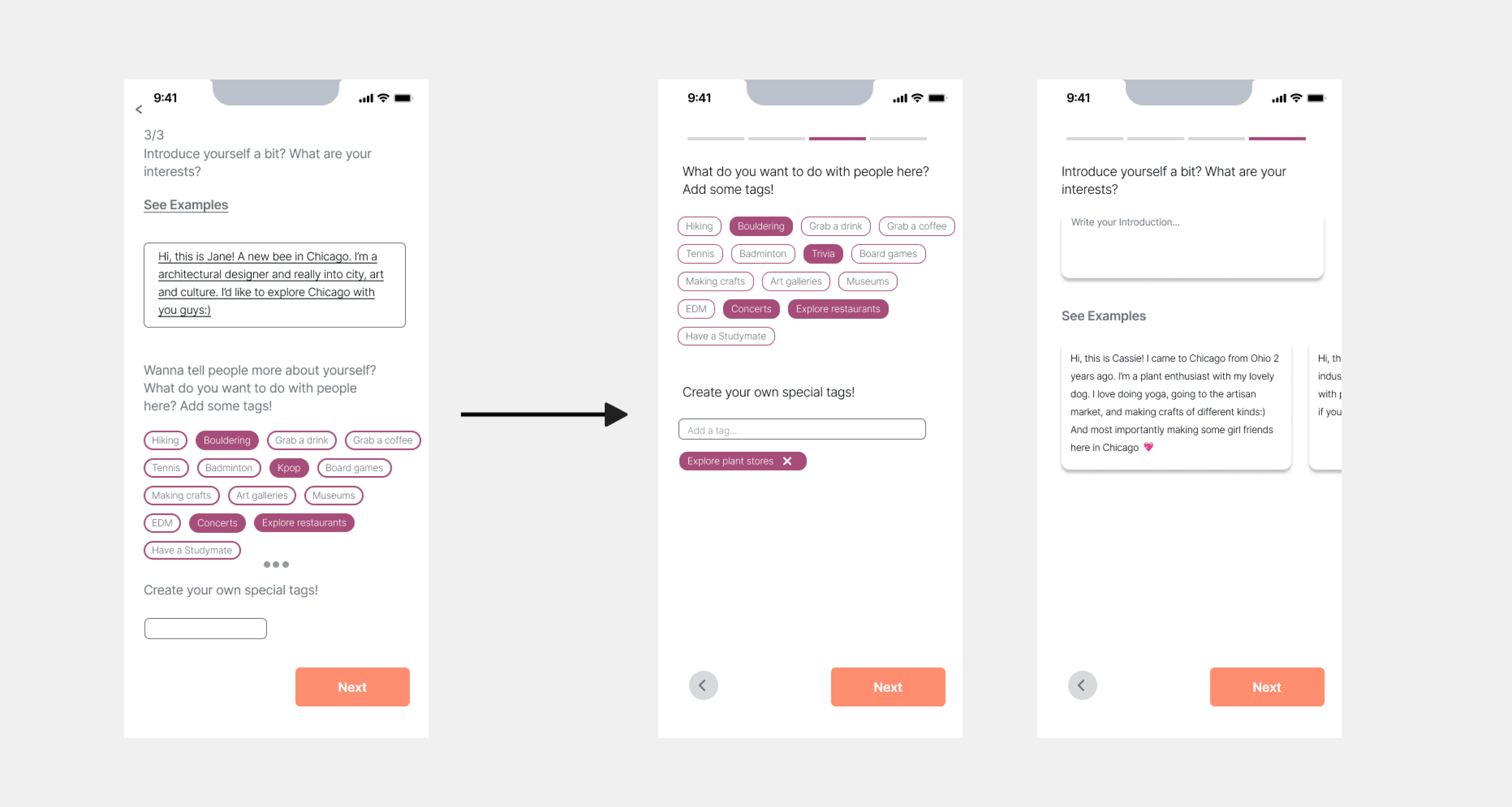
Introduction and tags flow is not clear
Almost every participant is confused at this page since there are so many information and actions that need to be be taken.
solution:
Make the action simple in each page
The interest tags and introduction sections are separated into two pages. And as the users mentioned the tags are more appealing to them and easy to click, so I prioritize the tag section first.
before and after screens
Issue 2:
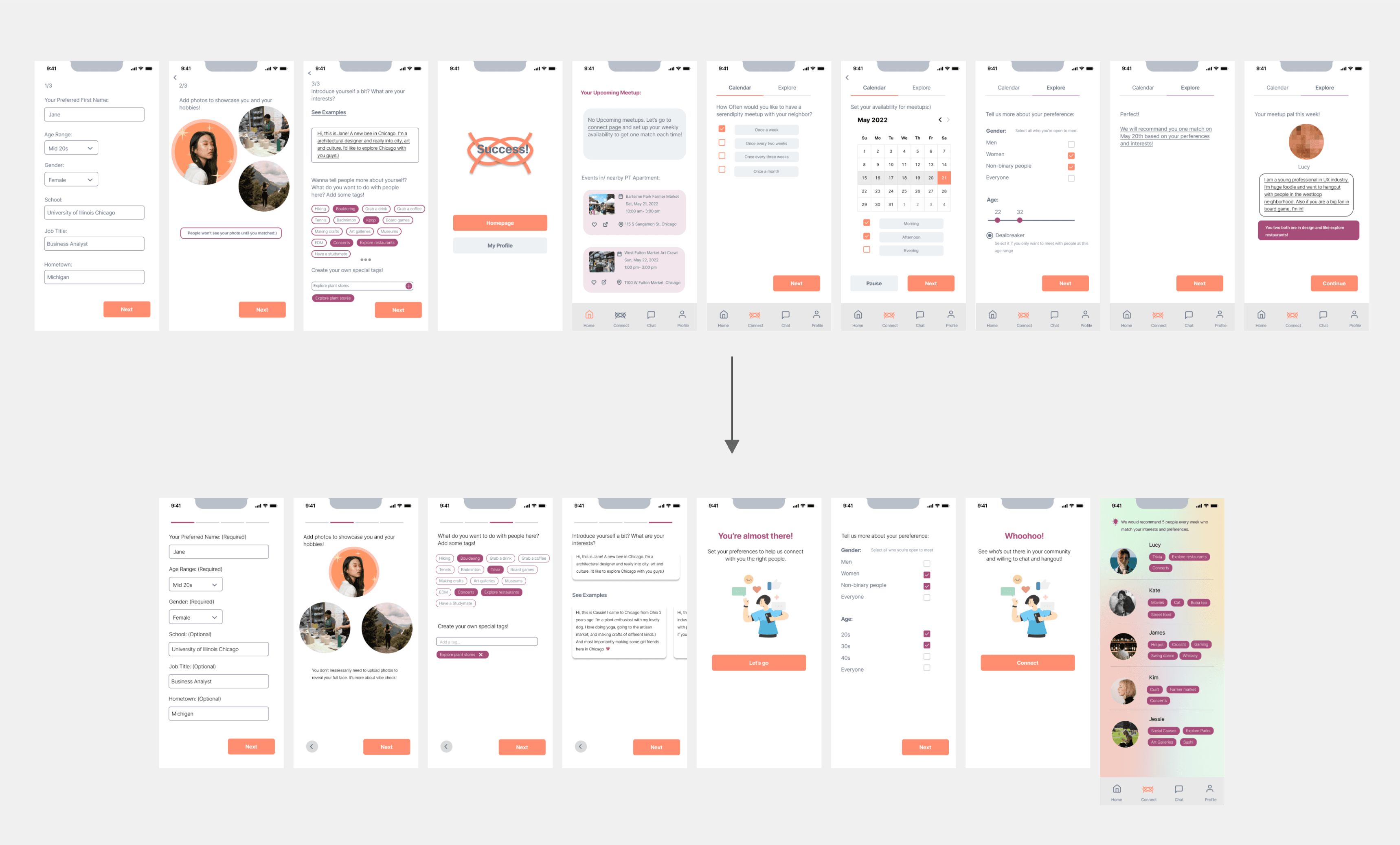
Setting preferences flow is confusing
The flow from creating a profile to calendar availability and preferences setting is confusing to more than one user. They questioned the reason why to put preference after the calendar part and why to have a calendar. Also, They want to see more possible people.
solution:
Eliminate the set calendar section and combine the preference within the create profile flow
Adding the set preference section into the create profile flow so that the user would click a series of screen and then directly see the result: possible connections with more choices.
Before and After Screen
Issue 3:
Home page is not clear enough.
More than one users are more appeal to the event section in the home page and a lot of them wanted to click the events first rather than go to the connect part in previous design.
solution:
Redesign the home page and separate the meetup and event section.
Adding two tabs on the home page for meetup and event, so that the users could clearly see their upcoming meetups and explore any events on the other tab.
Before and after screens


